ShopDreamUp AI ArtDreamUp
Deviation Actions


Description
Facebook fan page: [link] |  You can buy this image in my Shutterstock Gallery or Dreamstime Gallery.
Sign up for free at [link] and start to make $$$ ") from your photos!
from your photos!  (Wink)")
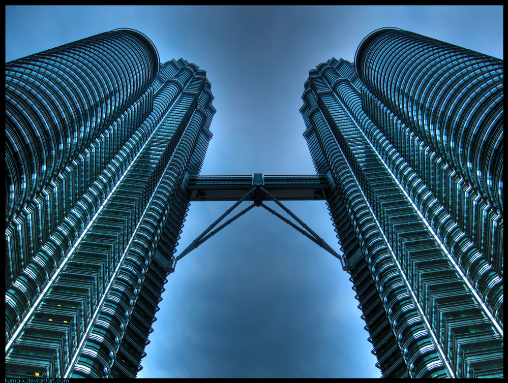
Standing under the giant and majestic Petronas Twin Towers in Kuala Lumpur it was like standing under a big space shuttle. This monumental buildings with the tops in the clouds they were the world's tallest buildings from 1998 to 2004.
//HDR by Kuma with Canon Powershot A590IS + Photomatix 3.1 Pro + Adobe Photoshop CS3//
The picture was used in the Around The World Calendar 2011


Don't be afraid to:
Image size
999x754px 1.5 MB
© 2009 - 2024 kuma-x
Comments211
Join the community to add your comment. Already a deviant? Log In
This is a great image from the start. The fact that the towers are centered helps to portray the size and "strength" of the subject. While the crisp details bring out the ornate beauty of the metal and glass.
What I like most about this image though is the tonality. Though it looks quite natural, the bluish tone just adds an aura to the image. The feeling that this helps create is one that emphasizes the strength of this building against a slightly ominous sky.
While almost everything looks good against a bright blue sky or in sunlight; you managed to make this building look great in less then ideal conditions. Something that is always easier said then done.
Last but not least is the final presentation. I like how you framed the image in black with only the thin blue border. This slightly elevates the feel of the image and gives a more professional appearance.
My only suggestion would be to move your signature to the lower right corner. Though this is only my personal taste.